Fearless Friday: Creating a Visual Experience.
It's no secret that much of how we consume information is through strong visuals. As they say, "a picture can speak a thousand words" and never were those words truer in a culture of Instagram, YouTube, Snapchat and the like. And thank goodness for this trend or I'd be outta a job!
While I am not a photographer, I do believe that a little practice never hurt. One could say I've been practicing how to take a good picture for the last 6.5 years. Lucky for me it's a hobby I quite enjoy and when I do hit a home run...you can bet that I am running up to my husband to share just how killer my photo was. He is a very patient human being, that one.
Today I am sharing a few quick tips on achieving blogging/Instagram success. I can tell you that 27K followers later, this recipe works for me and the 101 things i love aesthetic.
Photo by Gabrielle Daylor
- #livecolorfully: I am attracted to brights so this little hashtag works quite well for me. Whether it's my husband or myself taking the photos, I never post anything without editing. I have a formula that works for me which starts with brightening every image followed by a heavy dose of saturation. In other news, consumers are drawn to shades of blue and pink as a whole. I receive the most engagement when I post anything with these colors. My rule of thumb is if I'm wearing neutrals, I opt for a bright backdrop and if I am wearing bright colors, I opt for a neutral backdrop.
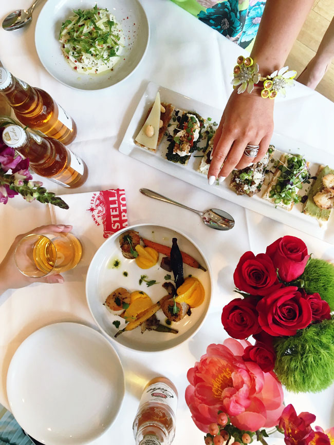
- I get by with a little help from my friends: Ever wonder how foodies achieve those amazing overhead food porn shots? It takes a village! We stand on chairs and sometimes, we even ask our friends to jump in and shine their iPhone flashlights or LuMee cases down on our plates for those really dim restaurants corners. Trying to achieve natural light is half the battle of taking a really great shot. The other half is getting some movement like you see above. Ask your kiddo or boyfriend to reach for that crostini...I promise you it will bring life to your otherwise ordinary food photo!
P/S When in doubt...add flowers!
Photo by Gabrielle Daylor
- Don't be so obvious: Some of the most interesting photos I've ever taken were not shot dead on. Sometimes just angling your phone ever so slightly can make for an interesting pic. The same goes for outfit shots. We don't need to see your entire body every time. Show us the details...an interesting neckline, a ruffle, a seam, your bracelets. Those details sometimes serve as the catalyst for your next affiliate sale. People like to know what they are buying + up close!
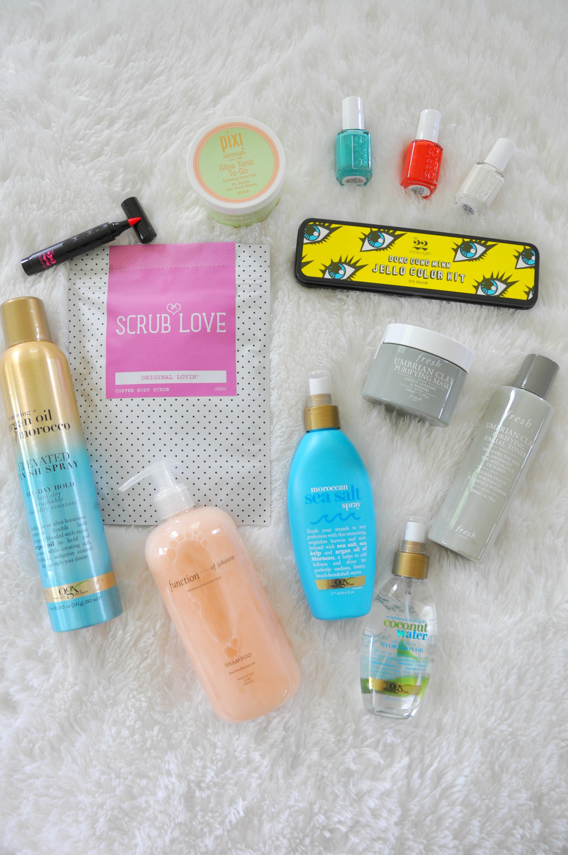
- Texture everywhere!: This is my favorite tip. Street art shot tightly can make for some really great texture as illustrated in the picture above with my skull necklace. You'd never know where that was shot but I will tell you...on Armitage in an alley! My other favorite trick when I am creatively tapped out? The old throw blanket trick! See above. Here's why it works - it's a bright, white surface which allows your subject to stand out and take center stage yet the fur texture makes it a bit softer and luxurious. The rest is all about styling the products using interesting angles and positions. Bonus: all colors stand out when it comes to neutral rugs and blankets making this bedroom shot much more sophisticated than it really was! Trust me, I was wearing a grubby tshirt and sweatpants.
Got any tricks you'd like to share? I'd love to hear 'em! Happy Friday!
Check out today's link ups: Style Elixir, Jo Lynn Shane, Mix & Match Fashion


When you have chronic pain, it feels like you're having chronic conversations about it, too. It's a joy-sucking, time-sucking event that can drain you mentally and physically.